Sunday 27 December 2009

RIVER ISLAND COMPETITION S/S 11


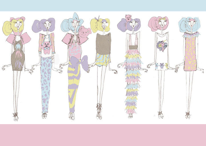
The Brief was to design a capsule collection for River Island, keeping in mind the company and their customer for spring/summer 2010. I have opted to produce a collection of a soft colour palette influenced by my travels to Thailand, i wanted the collection to have sophistication, i have designed garments with a sleek line, the 'bag waist band shorts' are my favourite i love the bag waist band and especially with a beaded finish. I feel the moodboard is the strongest board in hindsight i should have spent more time developing the technical board.

Wednesday 23 December 2009

INDIGO, PREMIER VISION S/S 11


Collection 2

Collection 2 has followed on from Collection 1, I've carried on looking at symmetry, i've used a sample of painted lines that i used whilst creating my butterfly painted images. I then manipulated the samples into symmetrical patterns, horizontal and vertical. I am really pleased with the outcome of this collection, i think it invokes a 'folk' style and sense to the collection, i can really see them in kaftan style dresses and tops.

Monday 21 December 2009

INDIGO, PREMIER VISION S/S 11


Collection 1


For S/S 2011 I have taken inspiration from butterflies, looking in particular at the symmetry of their wings, I've gone back to the method of painting onto one page, folding and pressing to produce a series of prints. This child-like method has meant that spontaneous marks and strokes within the butterfly prints have then inspired a series of complimentary prints. The collection has taken inspiration from Alexander McQueen, Basso and Brooke and Nathan Jenden. I've really loved the process of producing these prints, and have found the inky, subtle tones of the colour palette have really been enhanced by digital printing on a sand-washed silk.

Saturday 19 December 2009

STUDIO G

This week i went to show studio G my print collection in order to have the opportunity to take it to New York. The Studio itself is situated opposite the Fashion and Textiles Museum, its a really nice location and inside is amazing they've just had it all refurbished, the space would be amazing to work in. When showing my fronts, they were really positive, and it was great to get some professional feedback. Glenn liked my fronts and colour palette, i got the impression he didn't feel my prints were commercial enough or appropriate in context with his company's collections. The fabric and print were not as bright as they would have liked.

In general the experience was really positive and insightful, i learnt how a print studio works within the industry and got some important feedback from a professional. Glenn has worked selling print at trade fairs for years so knows what clients want.

Tuesday 15 December 2009

MAHARAJA EXHIBITION, V & A


Whilst visiting London i attended the Maharaja exhibition at the Victoria and Albert, the exhibition showcases Indian Royalty. The word maharaja, means literally ‘great king’, the exhibition really encompasses the great wealth and power of the Maharaja. It was an incredible exhibition, the magnificence and wealth of the Indian Royalty was shown through the rich colour and ornate fabrics. Although the exhibition hasn't directly influenced my work, i can definitely appreciate it and hope to aspire to produce such detailed and exquisite work.

The exhibition spans the period from the beginning of the 18th century to the mid- 20th century, bringing together over 250 magnificent objects, many being lent from India's royal collections for the first time. It examines the changing role of the Maharajas within a social and historical context and reveals how their patronage of the arts, both in India and Europe, resulted in splendid and beautiful objects symbolic of royal status, power and identity.

I find the history of India really interesting and it was a great insight to how the Indian Royalty lived and ruled, Embellishment is a strong theme within my work and especially sequining and bead work, this exhibition with its strong and rich colour palettes could really influence my final major project in a positive way.

Saturday 12 December 2009

FROM BRIEF TO BRA COMPETITION - S/S 11


'Cabinet of Curiosities'

I have decided to enter this competition using one of my initial print from my Premier Vision project. I loved the symmetry of this print and thought it would work well in lingerie. I'm not 100% sure appropriate my designs are to the brand as they are not overtly 'frilly' i think the print should be bold and strong on a beautifully soft fabric like a silk, with a lace trimming, i personally like undergarments that are simply but strong, this is why i have proposed these designs, the idea of using inspiration from the 1950's style 'waspie' but in a modern context i think works, the lingerie is flattening and accentuates a woman's figure subtly.

Thursday 10 December 2009

GRAYSON PERRY FOR LIBERTY

This is an example of oen of the textile prints that Grayson Perry has been commissioned by Libery to produce. I love this print, i love the colour palette but also the concept of a beautiful girly almost child-like print laced with a darker theme of military machinery. I'm using Grayson Perry as an example of an artist entering the fashion industry, within my dissertation.

'This fabric in Liberty’s and Perry’s eyes is art and is affordable at £19.95 a meter and has also has been applied within the fashion industry. Perry’s fabric designs are so versatile, as he states, it could be used to construct a garment or even framed and put on a wall, his work therefore is open ended and left to the discretion of the buyer, completely diminishing the Art and Fashion barrier. Is a canvas not just made from fabric? Fashion is now giving people a means to display and enjoy their art and also making art more accessible and portable in society. '

This is an extract from my dissertation about Grayson Perry.

Saturday 28 November 2009

MARK FAST S/S 10


When i saw Mark Fast's collection i felt a little bit uneasy i wasn't sure if he had endorsed a healthy curvier model or whether he was just exploiting them for publicity. He certainly got publicity!! I feel this way because his collection wasn't suited to the models he had, they didn't fit properly, which makes me think maybe it was a last minute decision, if anything i think he damaged the campaign for healthier models.

On this subject as well i found it amusing that L'Official magazine when showing imagery of Mark Fast's collection did not show one image of a 'plus size' model, as though it didn't even happen!

Saturday 21 November 2009

BETSEY JOHNSON S/S 10


'Betsey's One Night Stand'

The lineup was a bit posher than the usual. With Betsey Johnson, i love her flare for sophisticated yet fun and fresh fashion, i loved the more developed leopard print, and the colour ways throughout the collection were perfect. I'm currently thinking about including animal print in my final collection, and this has really helped me visual a colourful animal print alternative, that keeps a youthful edge.

Tuesday 10 November 2009

DISSERTATION RESEARCH

http://www.guardian.co.uk/artanddesign/2003/jul/13/art.artsfeatures1

Whilst researching my dissertation, 'Where does Fashion sit in Art' i stumbled across this article on the Guardian website.

I totally disagree with Alice Rawsthorn stance on the debate.
Rawsthorn argument in my opinion seems narrow minded.

Saturday 7 November 2009

STUDIO G

Today we had a seminar from a company called 'STUDIO G'. Studio G is a print design studio that produces work to sell at trade events such as Indigo Paris, New York, LA, Milan and Hong Kong. It is a relatively small studio set up by a man called Glenn, he then has a collection of print designers that work for him. Glenn talked to us about his company and the process they go through to produce their collections, they start with a moodboard that reflects the catwalk trends they then choose a trend as a basis for their prints. They design for the high street, so thier prints are very commercial. The seminar was really insightful, i hadn't previously considered working for a studio but the way in which the company works seems really close knit.


We have the opportunity to design a collection for the Studio, this will give us the opportunity to sell our work in New York as well as with the university at Indigo, Paris. Glenn's preference is to use photoshop, and he would like us to produce a collection on the basis of a catwalk trend. In order to be picked to sell at New York we will need to make sure our collection is cohesive to the studio G style. My current collection is heading towards digital print so hopefully my collection for the module will be appropriate to show him

Monday 2 November 2009

DIOR


I adore these images from Dior, Galliano has clearly taken inspiration from the 'artist' i love the brush stroke prints and the embellishment over the top to add a defined line. I feel it works beautifully, the colours are strong and romantic and the black line just adds an artistic escapism to the collection.

Wednesday 21 October 2009

FRANÇOIS NARS

www.15x15project.com


Marc Jacobs by François Nars

http://www.style.com/beauty/beautifullives/042409_Francois_Nars

Friday 16 October 2009

ALEXANDER MCQUEEN S/S10


McQueens AMAZING collection, has been core to the development of my print project for Indigo. i love the symmetry within the collection and also the animalistic vibes. I am looking to Butterflies, symmetry and artistic marks to create the collection and McQueens collection when comparing to butterfly wings is almost identical.
McQueens choice to show his collection through the internet on a live feed was brilliant, i love McQueens attitude to fashion he does not have an elitist view. Like Nick Knight and SHOWstudio.com, who i have researched and included for my dissertation, he believes fashion can be for the masses.


A Nick Knight and Alexander McQueen Collaboration for www.showstudio.com

BASSO & BROOKE S/S 10


Neo-pop, the theme of Basso & Brooke's Spring collection, gave them a tailor-made opportunity to duplicate on fabric (and micro sequin) I love their strong interest in black and white within the collection, it was a great counterpoint to all the colour.
I loved the presence of beading that covered the body of a dress, i adore bead and sequin work, and the way that Basso & Brooke transferred their print into such beautiful beadwork really inspires me. The shapes were streamlined to maximise the effects of the prints, and the prints shone. The collection has really made me consider the direction of my prints, i love this more graphical genre of print, but i am not sure if it suits my design aesthetic.