The Brief was to design a capsule collection for River Island, keeping in mind the company and their customer for spring/summer 2010. I have opted to produce a collection of a soft colour palette influenced by my travels to Thailand, i wanted the collection to have sophistication, i have designed garments with a sleek line, the 'bag waist band shorts' are my favourite i love the bag waist band and especially with a beaded finish. I feel the moodboard is the strongest board in hindsight i should have spent more time developing the technical board.
Sunday, 27 December 2009
Thursday, 24 December 2009
Wednesday, 23 December 2009
INDIGO, PREMIER VISION S/S 11
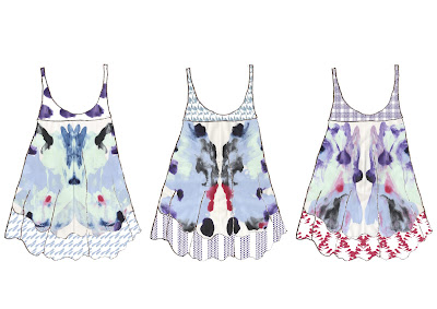
Collection 2 has followed on from Collection 1, I've carried on looking at symmetry, i've used a sample of painted lines that i used whilst creating my butterfly painted images. I then manipulated the samples into symmetrical patterns, horizontal and vertical. I am really pleased with the outcome of this collection, i think it invokes a 'folk' style and sense to the collection, i can really see them in kaftan style dresses and tops.
Monday, 21 December 2009
INDIGO, PREMIER VISION S/S 11
Collection 1
Saturday, 19 December 2009
STUDIO G
This week i went to show studio G my print collection in order to have the opportunity to take it to New York. The Studio itself is situated opposite the Fashion and Textiles Museum, its a really nice location and inside is amazing they've just had it all refurbished, the space would be amazing to work in. When showing my fronts, they were really positive, and it was great to get some professional feedback. Glenn liked my fronts and colour palette, i got the impression he didn't feel my prints were commercial enough or appropriate in context with his company's collections. The fabric and print were not as bright as they would have liked.
In general the experience was really positive and insightful, i learnt how a print studio works within the industry and got some important feedback from a professional. Glenn has worked selling print at trade fairs for years so knows what clients want.
Tuesday, 15 December 2009
MAHARAJA EXHIBITION, V & A
Whilst visiting London i attended the Maharaja exhibition at the Victoria and Albert, the exhibition showcases Indian Royalty. The word maharaja, means literally ‘great king’, the exhibition really encompasses the great wealth and power of the Maharaja. It was an incredible exhibition, the magnificence and wealth of the Indian Royalty was shown through the rich colour and ornate fabrics. Although the exhibition hasn't directly influenced my work, i can definitely appreciate it and hope to aspire to produce such detailed and exquisite work.
The exhibition spans the period from the beginning of the 18th century to the mid- 20th century, bringing together over 250 magnificent objects, many being lent from India's royal collections for the first time. It examines the changing role of the Maharajas within a social and historical context and reveals how their patronage of the arts, both in India and Europe, resulted in splendid and beautiful objects symbolic of royal status, power and identity.
I find the history of India really interesting and it was a great insight to how the Indian Royalty lived and ruled, Embellishment is a strong theme within my work and especially sequining and bead work, this exhibition with its strong and rich colour palettes could really influence my final major project in a positive way.
Saturday, 12 December 2009
FROM BRIEF TO BRA COMPETITION - S/S 11
'Cabinet of Curiosities'
I have decided to enter this competition using one of my initial print from my Premier Vision project. I loved the symmetry of this print and thought it would work well in lingerie. I'm not 100% sure appropriate my designs are to the brand as they are not overtly 'frilly' i think the print should be bold and strong on a beautifully soft fabric like a silk, with a lace trimming, i personally like undergarments that are simply but strong, this is why i have proposed these designs, the idea of using inspiration from the 1950's style 'waspie' but in a modern context i think works, the lingerie is flattening and accentuates a woman's figure subtly.
Thursday, 10 December 2009
GRAYSON PERRY FOR LIBERTY
This is an example of oen of the textile prints that Grayson Perry has been commissioned by Libery to produce. I love this print, i love the colour palette but also the concept of a beautiful girly almost child-like print laced with a darker theme of military machinery. I'm using Grayson Perry as an example of an artist entering the fashion industry, within my dissertation.
'This fabric in Liberty’s and Perry’s eyes is art and is affordable at £19.95 a meter and has also has been applied within the fashion industry. Perry’s fabric designs are so versatile, as he states, it could be used to construct a garment or even framed and put on a wall, his work therefore is open ended and left to the discretion of the buyer, completely diminishing the Art and Fashion barrier. Is a canvas not just made from fabric? Fashion is now giving people a means to display and enjoy their art and also making art more accessible and portable in society. '
This is an extract from my dissertation about Grayson Perry.
Subscribe to:
Posts (Atom)